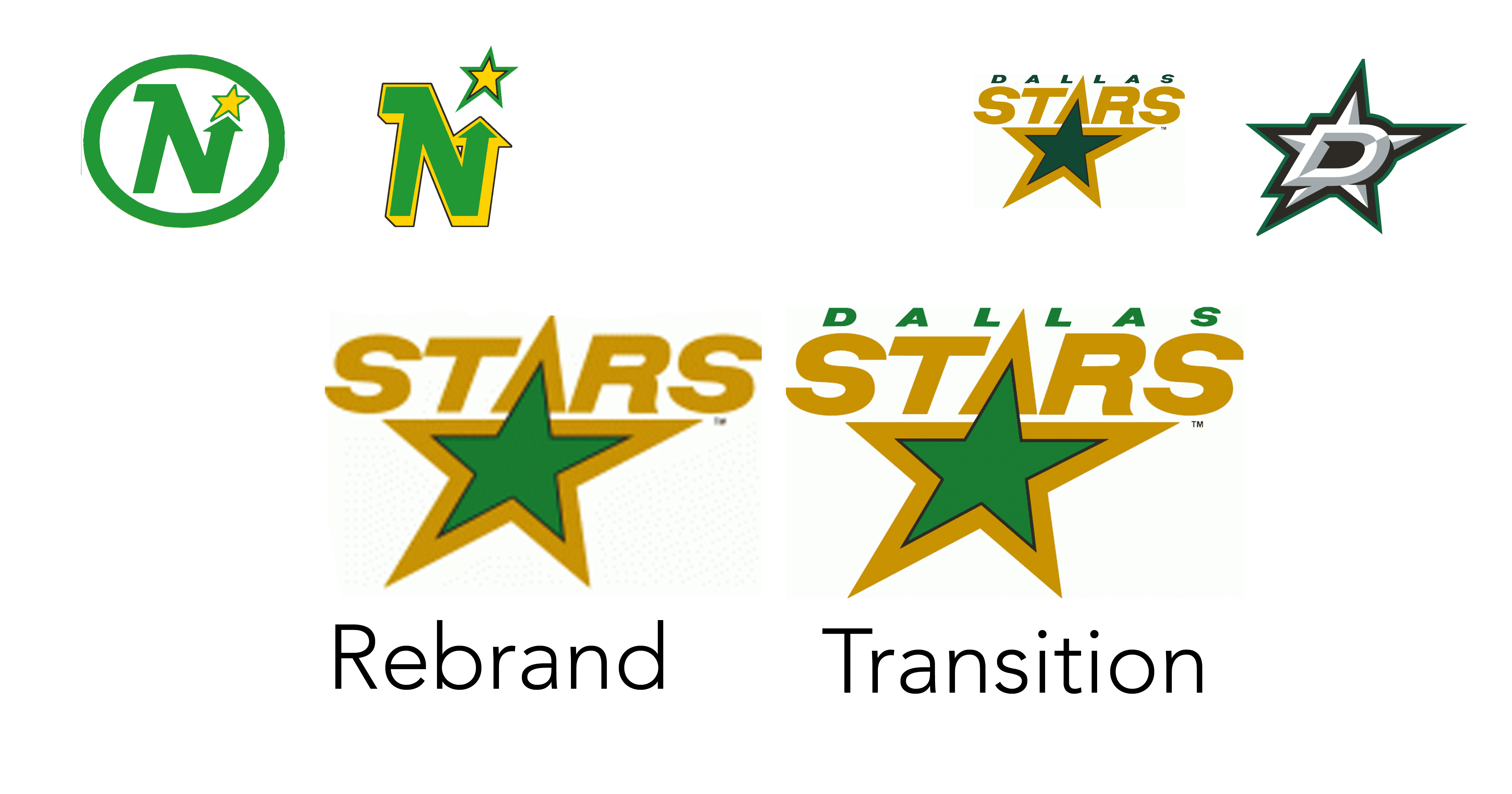
If designed well, a logo tells a lot about the brand’s mission and vision. When a organization decides to rebrand, it often accompanies a change in focus or tells the story of a longer-term strategic plan — sometimes this is explicitly stated in a grand announcement, and sometimes, it’s more subtle.
For an example of the latter, Curly only has to look in our own backyard and the story of Minnesota’s former NHL Hockey team, The Minnesota North Stars.
 In 1991, the state was abuzz with the new look of the team. What many failed to read is the significance of removing the word “North” or the letter “N” to signify the cardinal direction of the state from the logo. While the team in copy was still referred to as the Minnesota North Stars, its graphic showed no tie to any geography. What remained was simply the word “STARS.” Very utilitarian and easily placed in any context.
 And as you can see, made for an easy transition to a new owner: Dallas. The next transition was a simple color change that would then be used in the final iteration of the logo: a return to geo-centrism with the letter “D” (a throwback to the “N”) but with new color scheme making a North Star turn into a Lone Star.
When this rebrand was hatched, the ownership knew they planned to sell or had a buyer lined up. And this transition was handled with the utmost care and with a long-term plan to gradually change in order to mitigate consumer anger over the change.
So the next time your favorite team or company decides to rebrand, take a closer look: you might see more into their reasoning.

