In its 15th year, the traditional German celebration needed a new face for a new location in Rice Park.
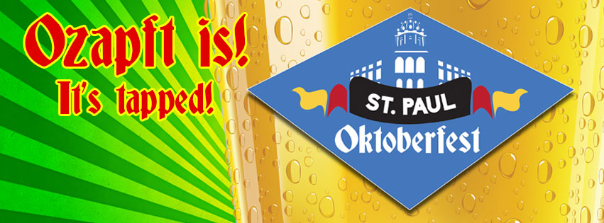
As Saint Paul Oktoberfest moved from Rice Street to Rice Park in the heart of its namesake, it needed a logo and tag that would make its original organizer and character, “The Kaiser” proud.
As a traditional beer festival, the tag is “It’s Tapped!” or “Ozapft Is!” was chosen to signify the golden tap that starts every traditional Oktoberfest. And, a strong reminder that it’s a beer festival.
The logo places the iconic capitol in a Bavarian diamond, a nod to the original home of the first Oktoberfest, and features a flag featuring German colors. The name St. Paul is in a modern font and Oktoberfest in a traditional Germanic font to show the bridge between past and present that this event creates.